Tuesday 10 December 2013

Write Up for Vinyl Back Cover

I started with a image from google of Example.


To make it reflex I flipped the original image then I recopied the original image.

I got an image of one of Example's logos which happened to be yellow blackground and black text. I used the magic wand tool to remove the yellow from the image then fitted the logo so that it fits inbetween the two faces.

Next I created the song list which is on every back cover for any album. First I had to find out which songs I was going to have on this album so I researched 6 songs and the length of the songs since the maximum amount of time on a 12" vinyl is around 20-28 minutes including both sides. So what I did was look at his biggest hits and tried to fit the top six.

Finally most items have a barcode so I looked up for one on google and inserted the image. To make it the right size I locked the shape so that it isn't stretched and fit it in the bottom right hand corner.

Write up for Vinyl Sticker

 
I made the background black like the vinyl then I started with the eclipse tool and made it a circle by making sure that the two dimensions were the same. Then I made it bigger but had to use the link tool so that the dimensions stayed the same.
To make the smaller circle I did the exact same as the first stage but made the smaller cicle black instead of white.

I got an image from google with Example in a concert. I put the image in the correct place then made the image invisible. I selected the white circle layer and made the image invisible then used the quick selection tool to select the area I want then I made the image visible again then selected that layer. After selecting that layer I copied it to create the image that will fit and also creating a new layer. Deleted the original image and made the black small circle the top layer.

To get the Example logo, I copied it from the front cover and made it smaller with the same dimensions

The final part is the text. To create the text I used the text tool and created a big enough box that will fit the 6 songs that would feature on the vinyl. I included the track, name of the song and the length of the song so that it looks professional and so that the user has knowledge of the length of the song.

Moodboard: Changed The Way You Kiss Me- Example


Moodboard: Changed The Way You Kiss Me - Example

The music video shows example going to a gig and then consists him performing and jumping into the crowd. The music video is shot in black & white the whole time.

The genre of the song is a mix of techno and house. Techno because of the electronic keyboard. It has a maintained fast beat throughout the song.

The target audience for this song is for people who: go clubbing, listen to house and other types of music like this.

In this moodboard it shows people in a club which is the type of music that you’d expect this to be played at. The idea of someone flying is from the lyrics ‘I've never been afraid of the highest heights,
Or afraid of flying now’. The reason behind having the lips on random people is that people in clubs sometimes try to kiss others and some may end up cheating, which might cause them to feel guilty and change the way they act with they’re other half. This could make them change the way they kiss them.

Moodboard: Close Enemies - Example


Moodboard: Close Enemies by Example

This song talks about having your enemies closer than your friends. The music video features a woman who changes from being alive to being a zombie which could mean that the women is the enemy but is the one that he’s close too.

The genre of the music is a mix of a dubstep/house beat with fast spoken vocals (little bit of rap) and slower vocals.

The target audience for this song is for people who go clubbing, listen to example or listen to either of these genres; light dubstep, house, rap or anything like these genres.

I tried to make my moodboard show what I thought about the song. The image in the middle is an image from the music video which shows the idea of keeping your enemies closer. I chose the background to be in a tunnel because the song felt very dark and what better place than a tunnel since it only have two ways to go, towards the enemy or turn and run. ‘Smile = trouble maker’ I thought of from hearing the actual lyrics Your smile should've told me you're trouble’


Moodboard: Midnight Run - Example


Moodboard: Midnight Run by Example

The music video shows example going on a road trip after sinking in the bath tub and waking up in a spring. The video finishes under the northern lights. The midnight run title could be used to resemble the idea of the guy founding with a brief case with something within and that he’s trying to outrun the guy on a bike.

The genre of the song is a mix of light dubstep and a slow house beat with the lyrics spoken at a range of speeds.

The target audience for this is for people who enjoy listening to: house, light dubstep, possibly rap and people who enjoy listening to examples unique twist on the song’s beat.

With this moodboard I tried to show the different aspects within the song like the lyrics and its metaphors.  Clearly when he was talking about midnight run I chose two images that would represent this which was a full moon and a person running but then I decided to listen more into the lyrics and it says ‘Got a couple of skeletons in my closet, couple of skeletons in my bed,
Couple of skeletons in my wallet, couple of skeletons in my head’. Clearly he has something to hide so I chose the image to be a load of bones that have fallen out of the closet. The other half of the background is a still shot from the music video to the song. I used this because midnight run might have two different means ‘a midnight jog’ or where someone is driving away from everything that they have, the expression on example’s face shows anger which enhances the feeling in the still frame.


Monday 9 December 2013

Write up for Front Cover of Vinyl Cover


This is the Original image that I started with.

I put it into Photoshop then adjusted it to black and white using the black & white tool in image - adjestments - black & white. As I'm going along I made every layer multiply, which is on the right hand side.


In order to get the kiss on his face, I created a copy of the original image then used the lasso to go around the kiss, copied the selected area, deleted original image, used the quick select tool and the eraser to remove anything that was on the layer that should be there.

To get the darken area i used a copy of the original image and cropped out the t-shirt. Turned it to black & white then increased the threshold (image - adjustments - threshold).
 

I reused the t-shirt that I cropped earlier and created an extra layer with is in. In that layer I played around with a few of the effects in the adjustment section (image - adjustment), some of them include vibrance, channel mixer, exposure and hue/saturation.
 

In order to do the lips on the t-shirt I had to crop each and every lip on his top. To do this I made a layer for each lip and cropped them from the original image using the lasso, quick select tool and the eraser. So that I know how they look on the t-shirt, I started with them in black & white so that they contrast with the pinky t-shirt. From there I merged all the layers to make one and to get the lips the same colour. To make the colour I used a range of effects in the adjustment section which include: vibrance, hue/saturation, channel mixer, brightness/contrast and colour balance.

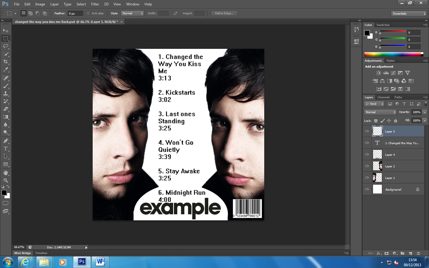
To get the Example logo I used an image from google and swapped the colours; the black was white, the white was black. So to do it wasn't too hard because all I had to do was invert it (image - adjustments - invert).

To get the title 'changed the way you kiss me' I found another image which had the same text that Example would normally use and cropped the letters out to finish off my front cover for my vinyl cover.


Wednesday 27 November 2013

Write up for Pop Art


start by taking a photo of yourself
import it into photoshop
go to image - mode - black & white
then go to image - adjustments - levels and edit the levels until you get a big enough difference between hair,skin and a white background
after doing that go back to image - mode - RGB colour which will flatten the image

duplicate the image so then you can edit each feature in a seperate image

change the setting of the image so that instead of being normal, change to multiple so that the layers sit on top of each other

I started on the background and simply used the bucket tool and made the background red. I made only made one layer visible at a time so that the other layers don't distrack me

to do the lips i used three versions of the colour yellow and layered them to show which areas of the lips which be brighter or darker
to do the eyes I made the pupils a purple colour along with a green on the rest of the eye
with the clothing i used two different colours to give the clothing a better effect.

i started to add the other layers in one by one so i can see how they affect each other


the image above is my final result. i don't think that it looks too bad but i can no longer see the purple in the eyes and the clothes are darker then i thought it would be. the hair has turned completely black too so it doesn't show any detail.


Wednesday 13 November 2013

Write Up for 1950's Poster


To create this poster I needed to think of an idea so what I did was use a modern film and turn it into a 1950's film poster so I used 'Jurassic Park'. To create the blocky effect on the leaves and background around the dinosaurs I used a posterize effect which can slowly degrade the image so it gets more and more blocky as you go down the levels. As soon as I picked the right level I knew that this would be the base of my poster. Changing the colour so that it looked like a 1950's poster I created two layers; one for the black areas so that was done by changing it to black and white by changing the exposure and then using the 'magic wand' effect to remove the white. To create this gradient of colour I added a photo filter which was like a mouldy orange colour along with changing the contrast. Posters in the 1950's always contained some of the most popular names on them so then people know that its well produced so what I did was use this to my advantage and add some of the most known actors and actresses to fill in the empty space in the top right hand side. The colour of the font is pretty bright from the rest of the image meaning that if anyone did walk pass it they can easily recognise the actors/actresses. The title of the film in its logo form was very easy to find on its own. I'd just crop it out and insert it into the poster. To darken it and get to to fit in with the theme I changed the exposure and contrast of the logo.


Wednesday 9 October 2013

Image of my 1950's Version of a Jurassic Park Poster


Write up for Magazine Cover


The image above is the inspiration for my version of the game magazine 'GamesMaster'. This cover only has one image that covers the front of the magazine which is a bit plain so I decided to include one or two other games as it'll appeal to a larger audience. My Version includes some good games that everyone knows like 'Mario Kart Wii' and 'Assassin's Creed'. My Version doesn't have some parts like the 'No.1 for ...' and the list of other games within the magazine. So for next time I need to include these features as they are part of the magazine as they are in every copy. Also instead of using the standard yellow, black and white text colours I picked red as it stands on the blue background. In order to get the images on top on the 'Mario Kart' background I had to manual crop them using the quick selection tool which selects anything that's in the brush/circle area and then I delete it if it hasn't selected anything that I need. Another tool that I used a lot was the 'magic wand' because you select a section of colour and it'll highlight the whole area and makes it easy to use and delete specific areas. To improve this I need to look into more detail into the magazine as some have different styles of text and layout (e.g. The colour of the text and border around it.). Also the one on the left has only one image making it the main focus of the front cover and on mine the 'Borderlands 2' image is attracting a lot of the focus instead of the 'Mario Kart' image. More text about the rest of the magazine and not just about the stuff on the front of the magazine. 'The Walking Dead' image is also too small so next time need to make sure that I find the right size for the cover. The 'Mario Kart' image is missing its name as it is behind the magazine name which would clearly have more priority over the name of the game. I quite like the 'Mario Kart' image as the background because it's a very well and loved game but also the quality of the image is really good since I had to stretch the image. The borderlands 2 image was quite hard to find with all the characters together without a background because the background of the characters that found was quite hard to do as it had bits of grass foilage and monsters around them.